Color
management: Implementation part 2:
Monitor
profiling, workflow details
by Norman
Koren
updated
Jan. 14, 2004
Thanks
to Dennis Wilkins and Jonathan Sachs for excellent suggestions and
extensive
proofreading.
The series begins with an Introduction
to color management and color science. Implementation
part 1 describes how to set up color management and
interpret the
contents of
ICC profiles
(files
that describe the color response of a device or a color
space). It features Picture
Window Pro, but also includes information on Photoshop. Implementation
part 2 (this page) discusses monitor profiling and
workflow details.
The series continues with Obtaining
ICC profiles and building them with MonacoEZcolor
and Evaluating
printers and ICC profiles.
Monitor
profiling and calibration
To
properly calibrate and profile your monitor, your video card should
have a color lookup tables (LUT). Most recent cards have them. If yours
doesn't, go out and get one that does-- even inexpensive cards have
them
nowadays. If that isn't practical, consult the Color
Management tutorial, pp. 19-26, for options.
This is a good time to clarify the distinction between monitor
calibration
and characterization
(or profiling).
- Calibration involves
setting the display, which comprises
the lookup table (LUT) and monitor, to operate at a specified standard,
for example, at a white point of 6500K and a gamma of 2.2. Calibration
typically involves setting controls on the monitor-- Contrast,
Brightness
(also called Black level) and Color temperature-- and loading values
into
the LUT. Monitor settings are summarized
below;
the calibration process is detailed in the Monitor
calibration and gamma page.
- Characterization
(or profiling)
a display involves
describing the colors and tones produced by a calibrated
display
in response to numeric data, and storing the characterization in the Monitor
profile. This allows an appropriate
gamut transformation
to be performed when an image is sent to the display. Since the
display comprises the LUT and the monitor, "display
profile" might
be a better description.
Windows recognizes a Default monitor profile,
which is used by most LUT loader programs and some image editors,
though
its existence has no immediate effect on monitor calibration. You can
find
the Windows default monitor profile by one of two routes. Open the
Control
Panel, then click on Display,
Settings,
Advanced,
Color
management. Alternatively, right click on the screen
background
(wallpaper), then click on Properties,
Settings,
Advanced,
Color
management. The Current monitor, the Default monitor
profile, and
a list of ICC profiles associated with the monitor are displayed.
There is a good deal of confusion for a simple reason: Monitor
profiles
often contain information used by LUT loader programs to calibrate the
monitor; hence they play a role in both calibrating
the monitor
and characterizing it. And the
characterization stored in
the profile plays a role in altering the image sent to the monitor, as
shown below.
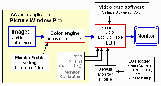
Image flow from memory to
monitor.
There are two places where an image can be altered on the way
from the
image editor to the monitor.
 In
the image editor, under control of the color engine. If color
management
is enabled and a profile (other than None)
is specified in Picture Window Pro's Monitor
Profile setting, the image will be mapped from the working
color
space to the monitor profile space. The Monitor
Profile setting affects the display for PW Pro only.
(Photoshop
6 uses the Windows default monitor profile for this purpose.)
- In the color lookup table (LUT),
which can
be set by LUT loader
programs or by video card software as a part of the calibration
process.
LUT settings affect the appearance of the display for all
programs.
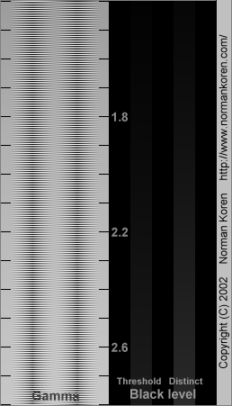
The best way to learn how monitor calibration and profiling
affect the
display is to try out different settings. I recommend downloading the
calibration
chart on the right and opening it in your image editor. It is a
powerful
diagnostic tool that provides an accurate indication of gamma and black
level. Instructions can be found in the Monitor
calibration page. The chart works for monitor display only,
not for
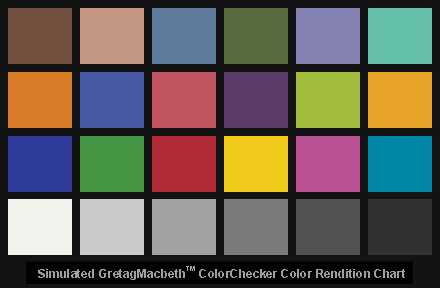
hardcopy. For color I've included simulated GretagMacbeth ColorChecker
charts in two color spaces, sRGB and Adobe RGB (1998), at the bottom
of this page.
Several programs calibrate and profile
monitors. These include
MonacoEZcolor,
Colorvision
SpyderPro with OptiCAL, and GretagMacbeth
Eye-One Display, and Profile Mechanic - Monitor. These programs are described in more detail in the Monitor
calibration page. All of them measure the monitor with a
colorimeter,
then create a profile with instructions for loading the LUT. This
profile
is set as the Windows default monitor profile. Shortcuts to their
respective
LUT loader programs are placed in the Windows startup directory. I have
MonacoEZcolor,
which installs MonacoGamma as its LUT loader.
The LUT can also be loaded ay other programs:
QuickGamma (which I recommend
for beginners who don't yet have colorimeter-driven software), Adobe
Gamma
(installed with Photoshop and run from the Control Panel), and video
driver
software. These are discussed in the Monitor
calibration page.
Monitor profile
glitches: Some monitor profiles have
incorrect values for
gamma in their TRC
(Tonal
Response Curve) tags, described above in Anatomy
of a profile. I've encountered two cases of interest.
- Monitor profiles generated by
MonacoEZcolor 2.1 and 2.5 had LUT loader
instructions that set display gamma to 2.2, but had TRC curves with
gamma
= 2.0 (on my computer). This was an error, corrected in
version 2.6.
When I used the MonacoEZcolor profile as the Monitor profile in PW Pro
(or used it as the Windows Default profile, which is recognized by
Photoshop),
a gamut mapping took place that boosted the visible display gamma from
the correct value of 2.2 to around 2.5.
- Monitor profiles formerly available from Sony's support website had TRC curves set
for gamma = 2.5: inappropriate for a monitor calibrated to gamma = 2.2. If you happen to be using an old Sony profile, beware.
Beware
of generic monitor profiles. It's
always a good idea to check the TRC tags in monitor profiles with ICC
Profile Inspector,
especially if you see inconsistencies
in the display gamma. Another glitch: MonacoGamma doesn't always work
after
my ATI Radeon video driver software has been used to set the LUT. Adobe
Gamma works more consistently. Since both these programs use the
vcgt
tags in the Windows default monitor profile, I use Adobe Gamma when I
need
to set the LUT after I've booted (using the profile created by
MonacoEZcolor).
Are we having fun yet?
Images in non-ICM aware programs are assumed to have the sRGB
color
space. No gamut mapping takes place when they are sent (through the
LUT)
to the monitor. This works reasonably well because CRT monitors are
fairly
close to the standard sRGB profile, sRGB
IEC61966-2.1.
| Monitor
viewing conditions (a review) Since
one of the principal goals of color management is to produce prints
that
match the monitor image, correct monitor viewing conditions are vital.
More detail can be found in Monitor
calibration. |
- Your
monitor should be operated
in subdued light; dark areas of the screen should appear dark to the
eye.
- Set
your monitor's color temperature
(white point) to 6500K, D65, or sRGB, which is equivalent to 6500K. The
5000K setting appears too dull and yellow on most CRT monitors.
- Your
display adaptor software
should be set to 24 or 32 bit color (True Color).
- I
use a
SoLuxDesk
Task Lamp with a 4700K 36 degree 50W bulb for viewing prints.
The SoLux
has a CRI (color rendering index) of 0.98.
At the 6500K monitor setting, a white sheet of paper viewed under the
SoLux
lamp looks a tiny bit yellower (warmer) than white areas on the monitor
screen. This is not a problem since the eye adapts quickly when moving
from the monitor to the print.
- Alternative
lamps: Two promising choices are Ott-Lite's
18W VisionSaverTM
series, which has a color temperature of about 5300K and CRI = 0.95, and Sunwave
5500K fluorescent bulbs, which come in both tubes and compact screw-in
models, have good brightness and CRI = 0.93.
The Philips 287813 15 watt screw-in daylight compact fluorescent bulb:
5000K, CRI = 0.82, is available at Home
Depot, SKU #652746, about $15. It's quite bright. Other
compact fluorescents:
Sunwave,
SunPro,
Panasonic,
and
Verilux.
I keep
a halogen desk lamp nearby to see what the print will look like in
typical
indoor lighting.
- Set
the Contrast to maximum
unless the image is too bright or harsh.
Adjust
gamma,
the parameter that describes the nonlinear relationship between image
pixels
and monitor brightness, and Brightness
(black level) using the Gamma
and black level chart. Several
procedures
are available. There is some interaction between brightness and gamma
adjustments,
so you may have to go back and forth between them.
|
|
Color
management workflow details
Once you've chosen appropriate settings, you
can
ignore color management most of the time, but there are instances where
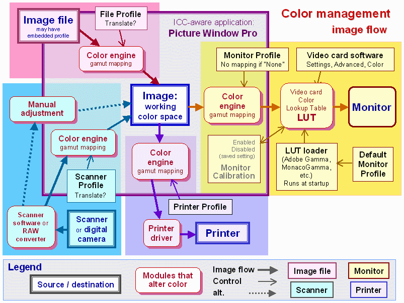
you need to pay attention. Refer to the diagram below
for the big picture. (To be
added: manual adjustments with scanners and digital cameras. Update
Photoshop
print)
- Profiles.
Much of
the effort involves obtaining
or building appropriate profiles. This includes profiling
your monitor,
printer/ink/paper combinations, film scanner and video camera (if you
have
one). Profiling film scanners is optional for situations like landscape
photography with negative film, where there is no control over the
lighting,
but it can be useful for studio photography with slides.
- Opening
Picture
Window Pro. You may want to
open the Color Management Settings dialog box at the start of an
editing
session to make sure it contains appropriate settings. You may keep it
open if you wish.
- Scanning. If your are
using a scanner
profile you have two choices.
1. Select the scanner profile and target color space in the scanner
driver,
if permitted. 2. Select it in PW Pro's Assumed Scanner Profile box. Do
not select both.
- Opening files. If a
file does not have an
embedded profile with
the (default) working color space, you will be asked if you want to
convert.
You answer depends on the context. If you are preparing images for
Internet
display, the answer will probably be "no." If you are preparing images
for high quality printout and your (default) working color space is one
with a larger gamut than sRGB, your answer will probably be "yes."
- Color
space.
The Working Color Space in the
Color Management settings box is the default or preferred setting. To
see
the actual color space of an image, i.e., the
associated profile
(if any), right-click on the image and click on Display Info.
- Attaching
or changing
color profiles. You may need to attach a profile to an image
or change
its color space, for example, when you are working in a color space
other
than sRGB and need to prepare the image for the Web. To change an
image's
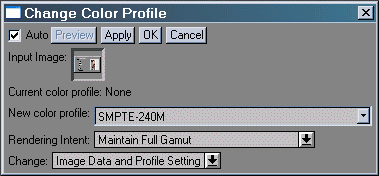
color space in Picture Window Pro, click on Transformation,
Color,
Change
Color Profile... This brings up the dialog box shown on
the right.
You can choose between three Change
options.
- Image
Data and Profile
Setting (the default) is shown. This is the setting you'd
use to
convert from one color space to another.
- Profile setting only.
Used to tag an image that had no profile setting or an incorrect
profile
setting: For example, Canon's File Viewer Utility can convert RAW
images
to Adobe RGB (1998), but it doesn't tag the image files. This makes
errors
almost inevitable, since untagged images are (by default) assumed to be
sRGB.
- Image data only
Rarely used, but you might find it instructive when you're learning
about
color management.
|  |
In Photoshop 6
the equivalent operations
are Image,
Mode,
Assign
Profile...(changes profile setting only; used to attach a
profile),
or Convert to Profile...
(changes image
data and profile setting).
- Soft-proofing is
a technique for previewing
the appearance of prints on a monitor. It works best for 4-color offset
printing, which has a smaller color gamut than most CRT monitors. It
has
limited applicability to high quality inkjet printers, which have a
larger
gamut, and hence can reproduce a number of colors outside the gamut of
most CRTs. It can, however, give a rough idea of the overall appearance
of the final print, and it can also be useful for comparing profiles.
For
example it reveals a difference in tonal balance between different
profiles
for the Epson 2200 with Premium Luster paper.
Soft-proofing should be disabled for most
editing
operations. Turning it on should make a rather subtle difference in
image
appearance. If the change is major, check you settings. Carefully
compare
soft proof images with prints. Soft-proofing is strongly dependent on
the
quality of the profile; it's not 100% accurate. But it can get you 50%,
or if you're very fortunate, 90% of the way toward matching the print.
In Picture Window
Pro, the Proofing
Profile setting in the Color
Management
Settings dialog box is normallly set to None
to disable soft-proofing. To enable it, select a printer profile (the
same
profile you plan to use for your printer/paper combination) for Proofing
Profile, and select a Proofing
Rendering
Intent, usually Maintain
Full Gamut
(perceptual) or Preserve
Identical Colors
and White Point (Relative Colorimetric). (I find Picture
Window
Pro's non-standard nomenclature to be somewhat confusing.) Proofing is
applied to all open images. Be sure to reset Proofing
Profile to None
when you're
finished.
Photoshop does a
more convenient job of soft-proofing.
You'd expect as much because Photoshop is aimed at the printing
industry,
where soft-proofing is an important part of the workflow. To enable (or
disable) soft-proofing, click View
and check (or uncheck) Proof
Colors.
I find this to be very convenient. To select a proofing profile and
rendering
intent, click View,
Proof
Setup, Custom...
You can find
more details by looking up Soft
proofs
in the Adobe Help index. Soft-proofing only applies to the images
selected
while settings are chosen. You can use Image,
Duplicate
to make a copy of the original image for comparison.
- Saving
files.
Associated profiles are embedded
in files saved in BMP, TIFF,
and
JPEG formats. (BMP is obsolescent; it's not generally
reocommended.)
- Printing.
You should be able to select the
printer profile either in the image editor (in the PW Pro Print dialog
box) or in the printer driver. The latest release of the Epson 2200
printer
driver software (v. 5.40+) allows you to apply the ICC profile of your
choice, but I don't recommend it because it has bugs. Do
not apply the printer profile in both places.
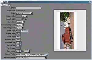
The Print dialog box (the
last box you see before
printing starts; right) asks you for the printer profile (below). These
two entries appear only when color management is enabled. Your answer
is
not saved. I would prefer to be able to enter a default printer profile
in the Color Management Settings dialog box, then have to option of
overriding
it when I print. You must be certain that your printer driver settings
are identical to the setting used to create the profile. You should
save
them with a similar name.
 |  |
If
color
management is enabled and your image files are in
color spaces other than None
or sRGB,
you must use a custom pofile; you should not print
with Color Adjustments
as detailed in Printer
calibration.
If you don't use a custom profile the printer driver will assume the
image
data is in sRGB color space. Images in larger gamut spaces will appear
unsaturated.
| Printing
with Photoshop 7 by John
Fellers (I
occasionally get questions on the subject.) |
| In
Photoshop
7.1 there are two techniques for applying ICC profiles to color managed
prints. I have used both successfully on the Epson 5500 and 2200.
The
first method (which I
no longer use) is,
- Click
on Image -> Mode -> Convert
to Profile to change the image's working or source profile to the paper
profile.
- Go
to 'Print with Preview.'
Make sure 'Show more options' is checked. Change the drop down list to
'Color Management' and set the destination profile is to 'Same as
source.'
Typically, select Perceptual rendering intent. If your image has
out-of-gamut
colors, you might want to try Relative Colorimetric.
- Click
on 'Page setup.' Select
the correct paper size and paper source.
- Click
on Printer/Properties,
turn off color management (very important), and make sure that the
correct
media type is selected.
I
learned this method at a seminar
last year given by Printing
& Imaging Association Mountain States.
My
preferred method is to not change the
working space of the
image to the paper space. I use the above method except that I keep the
Adobe RGB (1998) working space and enter a custom profile in the
destination
working space field (in the Color Management dialog.) |
| The Epson
Australia RGB Print Guide PS7 (Windows version) and
Mac
version cover printing with Photoshop 7. The
earlier Epson
Australia RGB Printing Guide (Windows version) and Mac
version cover printing color_management_2.html
Photoshop 6. |
|
.Workflow
summary
A
diagram of a color-managed image flow is shown below. It's not simple,
but I've tried to structure it to be somewhat comprehensible. Boxes
that
represent sources or destinations and boxes that alter color have
distinctive
appearances. See the Legend at the bottom. A simplified version is above.

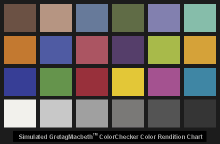
GretagMacbeth
ColorChecker test pattern
This
chart is widely used for matching photographic images. I offer these
two downloadable images to help you learn color management-- so you can
see what happens when you convert between color spaces with different
rendering
intents, etc. To take full advantage of these charts, you'll have to
purchase
an original. The pixel values calculated
by Bruce Lindbloom from measurements of a new ColorChecker with a calibrated
X-Rite 938 spectrophotometer. According to Bruce,
GretagMacbeth's own
data, printed on the sheet that comes with the ColorChecker, is not
colorimetrically
meaningful.
| 1.
SMPTE-240M embedded profile (same as Adobe RGB
1998).
All colors are within gamut. You can check the pixel values, copied
from
Bruce
Lindbloom's table for Adobe
(1998), with the PW Pro eyedropper.
The
colors in this chart should look undersaturated
in web browsers, which are not ICC aware,
but they should
look correct-- nearly identical to the sRGB image below-- in a properly
set up ICC-aware application. |
 |
| 2.
sRGB. Cyan (third
row, right) is out of gamut. Colors
were derived by converting from SMPTE-240M (above) with colorimetric
rendering
intent. They are close to Lindbloom's values but not exact; the error
(±2
out of 255) is typical for 24-bit color file gamut mapping. If your
monitor
is well calibrated, this chart should appear nearly identical to the
physical
chart viewed under appropriate lighting (except perhaps for
the cyan
patch, third row, right, which is outside the sRGB gamut). |
 |

|
Images
and text copyright (C) 2000-2013 by Norman Koren. Norman Koren lives
in Boulder, Colorado, where he worked in developing magnetic recording
technology for high capacity data storage systems until 2001. Since 2003 most of his time has been devoted to the development of Imatest. He has been involved with photography since 1964. |
 |


 In
the image editor, under control of the color engine. If color
management
is enabled and a profile (other than None)
is specified in Picture Window Pro's Monitor
Profile setting, the image will be mapped from the working
color
space to the monitor profile space. The Monitor
Profile setting affects the display for PW Pro only.
(Photoshop
6 uses the Windows default monitor profile for this purpose.)