Making fine prints in your digital darkroom
Printer calibration
by Norman Koren

|
|
 |
|
In this page we discuss the second step in matching monitor images with prints: printer calibration. The first step was Monitor calibration.
We present two approaches.
|
|
|
| A good test image is useful for evaluating your monitor's
quality and
calibration as well as the match between the monitor and printer. I
found
a nice image on The Digital Dog's website. Go to https://www.digitaldog.net/tips/index.shtml
and shift-click or right-click on Printer
Test File. Winzip (or a similar utility) must be installed on your system to
turn this file, whose default name is Printer Test file.jpg.zip,
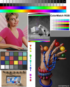
into a JPEG. The 1600x2000 pixel
image,
shown greatly reduced on the right, includes a portrait with good skin
tones, color and grayscale step charts, and the Gretag
Macbeth® ColorChecker color rendition chart. (Bruce
Lindbloom hasColorChecker RGB
values for various color spaces-- sRGB, Adobe 1998, etc.; Babelcolor (Danny Pascale) has an outstanding description of the ColorChecker.) While you're at Digital Dog's site, check out his many
excellent articles and tutorials.
[Color management information: The file has an embedded ICC profile tag for Apple ColorMatch color space (gamma = 1.8). In non-ICC aware applications, or in ICC-aware applications with color management turned off, this tag is simply ignored. No problem. But if you are using color management you must be aware of it. You should use an ICC printer profile rather than Color Controls settings, as described below. Why? Because when color management is enabled, there is a translation between the file color space and the monitor (display) color space. Other files, without profiles or with different profiles, translate differently. The Color Controls settings ignore the profiles-- no translation takes place; the relationship between print and monitor appearance won't be consistent. But all will be well if you use an ICC printer profile (that's what they're for). I don't recommend converting to another color space, though simply removing the profile tag doesn't do much damage (the Gretag Macbeth Colorcheker displays slightly dark).] |
 |
| . | |
| Another standard test image (below, right) originated with
PhotoDisc,
Inc., which has been absorbed into Getty
Images (no connection with the Getty
Museum). They have a nice page of articles
on color theory and management. A 10 MB (large)
high
quality JPEG of this image can be downloaded from Inkjetart.com--
one of my favorite sources of printing materials. The image size is 3225x5055
pixels. The colors are unsaturated (far from Velvia), apparently
because
the file data is for the Adobe RGB 1998 color space (see Color
management for an explanation of color spaces), but the file
contains
no embedded Adobe RGB 1998 profile. (Also, most web browsers do not
recognize
profiles-- they assume all images are in the default sRGB color space.)
[Color management information: The file (PDI-Target.jpg) has no embedded ICC profile tag. The file data is apparently for Adobe RGB 1998. That's why colors appear unsaturated in web browsers and image editors that assume sRGB file data. To get proper appearance-- correct saturation-- in a color managed workflow, you must add an ICC profile tag without changing the image data. In Picture Window Pro, you do this by clicking Transformation, Color, Change Color Profile..., then setting New Color Profile: to SMPTE-240M (or Adobe RGB, which is identical) and Change: to Profile Setting Only (not the default).] The same Inkjetart.com page has a very nice 2.6 MB 1080x1680 pixel TIFF test image. A 686x539 pixel test image which can be downloaded from Robyn Color Labs is shown below. |
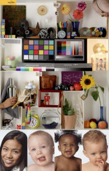 |
These test images are sharp-- they should give you a good idea of
what
to expect from an excellent digitized image printed at a pixel per inch
magnification of your choice. Color balance and tonalities should look
good if your monitor is properly calibrated.
|
| This is the first of the two approaches to matching monitor
images
with prints. It gives you the flexibility of making fine adjustments on
the print appearance-- color, brightness, and contrast. But it's
limited
to standard Epson papers (which are excellent and reasonably priced);
you
won't be able to use custom inks or fine art papers. This
approach does not use color management.
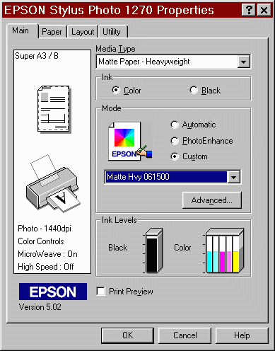
Turn your printer on, load it with paper and find the dialog box that allows you to adjust the print color, brightness, contrast and other settings. We use the Epson 1270 as an example. Other Epson printers (the 1280/1290 and 2200) have similar dialog boxes, with small variations. You'll need to calibrate each paper type individually. With a test print displayed in your image editing program, click on File, Print... Make sure the correct printer is selected. Then click on Properties. The screen on the right should appear. A chip on the ink cartridge enables the ink levels to be displayed. If you are using a paper size other than Letter (8½ x11 inches), click on the Paper tab to select the appropriate size. (I typically cut letter paper in half for test prints-- 5½x8½ inches-- and set Paper Size to Half Letter.) |
 |
 |
To maximize control over the final print, I use
Custom
mode. When you click on Custom,
a selection box appears just below it. The initial (default) contents
is
"Custom Settings."
The screen above shows "Matte
Hvy 061500," the name I gave my (old) settings for Matte
Heavyweight paper. I selected it from a list that appears when you
click
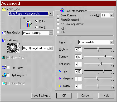
on the down arrow to the right of the box. To see the actual settings,
click on Advanced...
, and the screen to the left appears. If you leave the box at "Custom
Settings," you get the default settings (Gamma
= 1.8, Mode
=
Automatic, and all six sliders on the lower right set to
+0 for the 1270; Photo Enhance 4 for the 2200).
Select Media Type and other settings as appropriate. (1440 dpi is usually the best choice for Print Quality; there is little improvement with 2880 dpi.).You can adjust the settings that control the appearance of the print-- Gamma(D), Brightness, Contrast, Saturation, Cyan, Magenta and Yellow-- when Color Management is set to Color Controls. To make the print, click OK, three times. In Picture Window Pro a Print dialog box appears. Make sure paper size and other settings are correct. Then click OK. |
Keep making prints until you get a good subjective match between your monitor and your test prints. You can never get a perfect match because screen phosphors don't perfectly match printer dyes or pigments-- they have a different color gamut. Pay attention to skin tones, saturation and contrast. And pay special attention to gray tones, for the example the image of the dog in the center of Digital Dog's test image. It should appear neutral gray on the print as well as the monitor.
I suggest that you make your first print with the default settings, except for Gamma(D), which should be set to 2.2 on a PC (keep it at 1.8 for Macintosh)-- it should be consistent with your monitor calibration. Then adjust each of the settings in the direction you think it should go. You may change one or several at a time, as you please. Record the settings on each test print with a ballpoint pen. Learn what they do, and don't be afraid to make several prints! What you learn now will pay off later.
I view prints under a SoLux 4700K desk lamp, which has a color temperature close to daylight, and also under halogen desk lamp, which has a slightly higher color temperature than standard incandescent light, making it representative of a wide range of indoor illumination. Inkjet prints, especially Black & White prints, have a degree of viewing-illuminant sensitivity (also known as metamerism)-- their appearance can change subtly under different light sources.The table below illustrates the appearance of small color errors (in the amounts CC10, generated by the Picture Window Filter transformation, with white point restored using the Levels and Colors transformation and clicking on Full Range in HSL color space). This image has been used courtesy of Robyn Color Labs in Sunnyvale, California. It was designed for calibrating files to be sent out for Lightjet printing-- an excellent way of obtaining prints larger than you can make on home printers (typically 13 inches wide maximum). It can be downloaded as a 686x539 pixel TIFF file.
|
Tips: Be sure to select the correct Media Type. If you check the High Speed box, printing will be bidirectional. Check it for test prints. It doesn't make much difference in my 1270, but I leave the box unchecked when I want maximum print quality. Gamma(D) only affects midtones. If it's set too low midtones will appear too light; if it's set too high midtones will appear too dark. You can learn more about gamma below. The Epson software allows you to select Gammas of 1.5, 1.8 (the default; appropriate for Macintosh), and 2.2 (appropriate for Windows). My current settings are shown in the table below.
If you are using Picture Window Pro, you never need to resize the image for printing. PW Pro automatically rescales it using bicubic resampling and sends the image data directly to the printer at 1:1 (720 dpi for Epson printers). Prints are optimally sharp.Once you are pleased with the results-- you print has the same look and feel as the image on your screen, click on Save Settings... Give the setting a name that indicates the paper type. You will have to repeat this process for different paper types, but it will be much easier after the first time. [For the 1270, the settings are stored in Program Files\EPSON\Epson Stylus Photo 1270\E_DD01KE.UCF. You may want to save it if you're reinstalling a driver or operating system.]
|
You will need to select the correct printer setting for the first print you make each time you load your image editor. When you are ready to make a print, click on File, Print... Choose the correct printer, then click on Properties, Custom . Click on the down arrow to the right of the box and select the appropriate setting. Make sure the paper size is correct.
Here are my settings for the Epson
1270
and 2200. They work for me, but I
can't
promise they'll work for anyone else. The 1270 settings may not work on
the 1280/1290. Treat them as starting points for finding your own
settings
(to match your monitor). All the usual disclaimers apply.
In all cases I used Ink = Color, Mode = Custom. In the "Advanced..."
box,
Halftoning = High Quality Halftoning (not High Speed), Print Quality =
1440 dpi, Color Management = Color Controls, Gamma = 2.2 (for Windows),
and Mode = Photo-realistic.
| Paper | Settings (Please note the disclaimer above.) |
| 1270
Matte Heavyweight (color prints) |
Media type =
Matte Paper-
Heavyweight, Brightness = +3, Contrast = +6, Saturation = +2
Cyan = +4, Magenta = -3, Yellow = +4. (June 2002) |
| 1270
ColorLife (color prints) |
Media type =
Photo Quality
Glossy Film
Brightness = +1, Contrast = +4, Saturation = +0, Cyan = +0, Magenta = -17, Yellow = +5 Beautiful full-toned prints! Careful handling is required to protect against moisture. Appears to use less ink than Matte Heavyweight. Epson recommends Br +0, Contr +0, Sat +0, C -7, M -12, Y -7. Works very well for B&W. Epson supplies ICC profiles for the 1270 and 1280 . Click here for other printers. (June 2002) |
| 2200
Premium Luster (Photo Black ink) |
Media type =
Premium Luster
Brightness = -5, Contrast = +0, Saturation = +2 Cyan = +2, Magenta = +0, Yellow = +4. (Sept. 2002) |
| 1270
Matte Heavyweight (B&W prints)
OBSOLETE |
Media
type = Matte Paper- Heavyweight , Brightness = +1, Contrast = +6,
Saturation
= +0, Cyan = +1, Magenta = -5, Yellow = 0
I tried unseccessfully to duplicate the warmish tone of Agfa Portriga Rapid, selenium toned. See my new B&W workflow. |
| 1270
Premium Glossy (color prints)
Not up-to-date |
Media
type = Premium Glossy, Brightness = -2, Contrast = +12, Saturation =
+0,
Cyan = +10, Magenta = -2, Yellow = +0.
Paper and ink formulations have changed since I determined these settings. |
| 1270
Premium Semigloss (color prints)
(Luster is probably similar.) Not up-to-date |
Media
type = Premium Semigloss (Permium Luster is probably similar.)
Brightness = -2, Contrast = +12, Saturation = +0, Cyan = +8, Magenta = -1, Yellow = +0. Paper and ink formulations have changed since I determined these settings. |
The settings for Premium Glossy, Semigloss and Luster papers are out-of-date. Both paper and ink formulations have changed slighty. I stopped using them with the 1270 because, even in their latest versions with anti-oxidants, their longevity (10 years with a prayer) is not up to my standards; when the anti-oxidants are exhausted they are still subject to disastrous red shift fading. ColorLife has superior longevity. I no longer have the 1270.
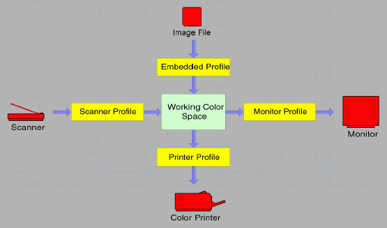
Programs that utilize color management are called "ICM-aware," where ICM stands for Image Color Management. ICM standards are maintained by the International Color Consortium.
Device color response and color spaces are characterized by ICC profiles, files that relate numeric image data, for example RGB (222,34,12), to colors expressed in a device-independent color space called a Profile Connection Space (PCS), either CIE-XYZ or CIELAB. Depending on the type of profile, the colors may represent a physical device-- a scanner, monitor, or printer-- or a color space, which is a mapping between numbers in an image file and the colors they represent. sRGB and Adobe RGB (1998) are the best-known color spaces, but there many more. Color space profiles have the same format as monitor profiles.
ICC profiles have the extension, ".icm." Profiles can also be embedded as tags within image files in the following formats: TIFF, JPEG, PNG, and BMP. Every image file has a color space associated with it, resulting from either an embedded profile or an implied profile, which assigned by the image editor or the operating system. The Windows default profile is sRGB, which has gamma = 2.2 and a color gamut comparable to a typical CRT monitor. Embedded profiles usually represent standard color spaces. But scanner, camera, or printer profiles can also be embedded in image files, sometimes by accident. These profiles can cause trouble during editing because they may not be perceptually uniform and gray balanced, i.e., a value with R = G = B may not represent neutral gray.
ICC Profiles Profiles may contain additional data, such as a preferred rendering intent, gamma, and instructions for loading video card lookup tables (monitor profiles only).
The heart of color management is the translation or gamut mapping between devices with different color gamuts and files with different color spaces. Gamut mapping is performed with one of the four rendering intents (gamut mapping algorithms) recognized by the ICC standard. The rendering intent determines how colors are handled that are present in the source but out of gamut in the destination. Since there are several nomenclatures for gamut mapping, I use a color code to distinguish the sources: ICC, Windows ICM 2.0, Picture Window Pro. Two of the four rendering intents are of interest to photographers.
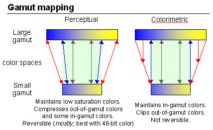 Perceptual,
also called Picture or Maintain
Full Gamut. Generally recommended for photographic
images.
The color gamut is expanded or compressed when moving between color
spaces
to maintain consistent overall appearance. Low saturation colors are
changed
very little. More saturated colors within the gamuts of both spaces may
be altered to differentiate them from saturated colors outside the
smaller
gamut space. In the diagram on the right, the left and right of the
color
space blocks represents saturated colors; the middle represents neutral
gray. Perceptual rendering applies the same gamut
compression to all images, even when the image contains no significant
out-of-gamut colors. Bruce
Fraser points out that for an image with unsaturated colors, e.g.,
with pastels, Relative Colorimetric rendering may produce a slightly
more
accurate result. Perceptual gamut mapping is mostly reversible;
it is most accurate in 48-bit color. None of the other rendering
intents
is reversible.
|
For Picture Window Pro I describe the workflow in Color Management Part 2. Once color management preferences are set up, the profile is selected in the Print dialog box. The prefiously-used profile is remembered.
For Photoshop 6 or 7 Epson Australia has some valuable guides. The Epson Australia RGB Print Guide PS7 (Windows version) and Mac version cover printing with Photoshop 7. The earlier Epson Australia RGB Printing Guide (Windows version) and Mac version cover printing with Photoshop 6. I've also posted John Fellers' Photoshop 7 workflow. Photoshop has the habit of changing procedures with each new release. Hopefully CS is similar to 7.
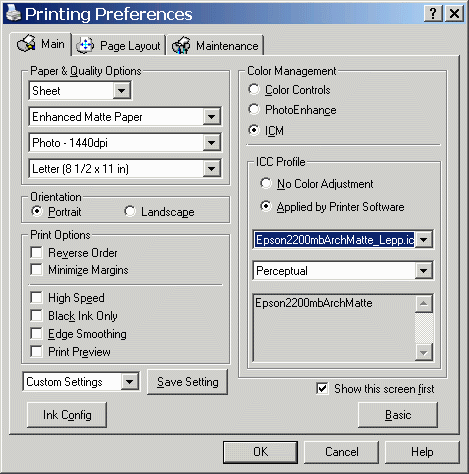
In the Printing Preferences dialog box (above), click on ICM, ICC Profile: No Color Adjustment. Media Type and other settings should be identical to those used to create the profile, typically Photo-1440 dpi, High Speed unchecked. If you have a good printer profile and your monitor is properly calibrated and profiled, the match between your monitor and print should be excellent.
Applying ICC profiles in the printer driver (doesn't function properly)This feature is supposedly implemented in Epson 2200 Printer Driver v5.40 (labeled v5.4aA in the Epson USA driver download site), but it has BUGS! I'll leave the text in gray until it works.I hope it works in a future release. It would be nice because it enables you to use profiles without an ICC-aware image editor. But applying profiles in an editor is preferable because it gives better control. Even if this approach worked, it wouldn't be my first choice. Epson USA suggests that you look at the Printer Basics (PDF) manual in the Manuals & Documents section of their website. It seems to correspond the the latest version (v5.40) of the printer driver, but it says nothing about "ICC Profile Applied by Printer Software." But it's in the Printing Preferences dialog box on the right. The problem is in the choice of profiles; many are missing. |
 |
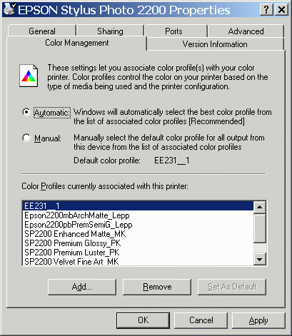
| You can install profiles for the Epson
2200 by
clicking on Control Panel,
double-clicking on Printers
and Faxes, right-clicking on Epson
Stylus Photo 2200, selecting Properties
(not to be confused with Preferences),
then clicking on the Color
Management
tab. The Properties dialog
box
is shown on the right.
When you click on Add you see a list of all the profiles in the Windows ICC profile directory. You can add or remove profiles as you please. EE321_1 is the "stealth" profile, used by the 2200 when ICM Color Management is not selected. The profiles you add should be listed in the Printing Preferences dialog box, above. But many are missing. I can only get a few-- and not necessarily the ones I want. This is a bug, and I won't bother with this approach again until Epson releases a new version of the printer driver (or someone tells me what I've done wrong.) This has been an exercise in frustration. But it has increased my appreciation of well-writen software, like Picture Window Pro, Capture One, and Neat Image. You can't take good software for granted. This isn't the first time a manufacturer of excellent hardware has lagged with software. Canon's digital SLRs get an "A" but their File Viewer Utility rates "C-" at best. |
 |
| A few words on Color Management | |
|

| Images and text copyright © 2000-2013 by Norman Koren. Norman Koren lives in Boulder, Colorado, where he worked in developing magnetic recording technology for high capacity data storage systems until 2001. Since 2003 most of his time has been devoted to the development of Imatest. He has been involved with photography since 1964. |  |