Color management and color science: Introduction
by Norman Koren

 |
|
Thanks to Dennis Wilkins and Jonathan Sachs for excellent suggestions and extensive proofreading.
Carlos E. Mora's two-part Spanish translation: Los modelos y espacios de color (II) Gestión del color y la ciencia del color: Introducción | Las Bases de la gestión del color.
The series begins with an Introduction to color management and color science (this page). Implementation part 1 describes how to set up color management and interpret the contents of ICC profiles (files that describe the color response of a device or a color space). It features Picture Window Pro, but includes information on Photoshop. Implementation part 2 discusses monitor profiling and workflow details. The series continues with Obtaining ICC profiles and building them with MonacoEZcolor and Evaluating printers and ICC profiles.
Background reading:
| Real World Color Management: Industrial-strength production techniques, by Bruce Fraser, Fred Bunting, and Chris Murphy. Paperback, 560 pages. The closest thing to a Color Management Bible. Buy it if you want to go into real depth. But as its subtitle "Industrial-strength production techniques" indicates, much of the material covers prepress applications (CMYK, etc.), which are of only indirect interest to photographers. | ||
| Mastering Digital Printing: The Photographer's and Artist's Guide to High-Quality Digital Output, by Harald Johnson. Paperback, 400 pages. Perhaps more for artists than photographers, it has a good introduction to color management. | ||
| Color Science: Concepts and Methods, Quantitative Data and Formulae, by Günther Wyszecki and W. S. Stiles. Paperback, 968 pages. A collection of scientific review papers-- not for the casual reader. This is the reference I use to verify questionable statements on color and color management in popular literature. It's the source. |
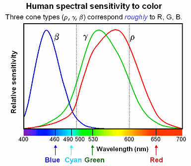 The
retina of the human eye has two categories of light receptor: rods,
which are active in dim light and have no color sensitivity, and cones,
which are active in bright light and provide us with our ability to
discriminate
color. You probably learned that the three types of cone are sensitive
to red, green, and blue (R, G, and B). Close,
but no cigar. The relative sensitivity
of the three receptors
for the "normal" human eye, designated by Greek letters beta, gamma and
rho (β, γ,
and ρ), is illustrated by the blue, green,
and red curves on the right.
Although
the beta and gamma sensors correspond closely to blue and green, the
rho
sensor (the red curve) isn't even close to red. An ink with the same
reflectivity
spectrum would appear yellow-orange.
The eye/brain discriminates color by processing the relative stimuli in the three sensors. R, G, and B are used as additive primary colors because their distribution across the visible spectrum produces a wide-gamut color image, not because they match the eye's response. Fewer than three colors is insufficient. Additional colors offers some advantage-- that's why recent inkjet photo printers have 6 to 8 colors. Combining three colors-- even monochromatic (spectrally pure) colors produced by lasers-- can produce most, though not all, of the colors the eye can see.
How is this known? A set of experiments is run using a split screen. Half is illuminated by a monochromatic light source with variable wavelength. The other half is illuminated by an adjustable combination of red, green and blue, which can be produced by lasers or by filters, which have a broader spectrum than lasers. If the two halves of the screen can be matched with some combination of the R, G, and B lights, then the color of the pure monochromatic light is within the gamut of colors defined by the three light sources. If no match is possible-- if white light must be added to the monochromatic source to provide a match-- then the color of the monochromatic source is out of gamut. This experiment shows that no combination of three real light sources can duplicate the full gamut of human vision.
Monitors with three phosphor colors (RGB) have
limited color gamuts;
printers with four ink colors (CMYK = cyan, magenta, yellow, black)
have
even smaller gamuts. Printers with additional colors-- 6 to 8 are not
uncommon--
have larger gamuts. The eye's peculiar response has consequences for
the
discipline called color
science,
which has arisen to quantify human vision. A detailed exposition would
overwhelming, but a few aspects, which are widely discussed but poorly
understood, are important for color management.
.
|
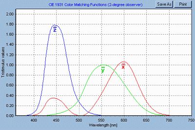
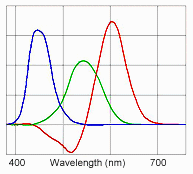 | In order to quantify human
color vision, the CIE
(Commission
Internationale de L'Éclairage)
has established a set of imaginary "red," "blue," and "green" primary
colors
that, when combined, cover the full gamut of human color vision, i.e.,
a combination of the three can match any monochromatic light source.
These
color primaries (shown on the left) have a curious property-- they have
negative energy in portions of their spectra, i.e., they are not
physically
realizable.
CIE Imaginary primaries |
 .
.
If two objects with different spectral reflectivities have the same color appearance (tristimulus values) under one light source, they are said to be metamerically matched. If they exhibit a marked difference under another light source (as with two pieces of cloth that look identical in a shop but different outdoors), they suffer from viewing illuminant sensitivity, frequently called metamerism. (This definition is misleading, but it has become so prevalent I won't try to fight it.) This phenomenon is most visible with neutral colors (grays). It is a problem with many color printers, particularly with Black & White prints; it was particularly severe with the Epson 2000P, but newer printers (2005 and later) have largely solved the problem. In actuality, metamerism, properly defined, is not a bad thing: it enables a combination of just a few inks to take on the colors of a wide range of objects.
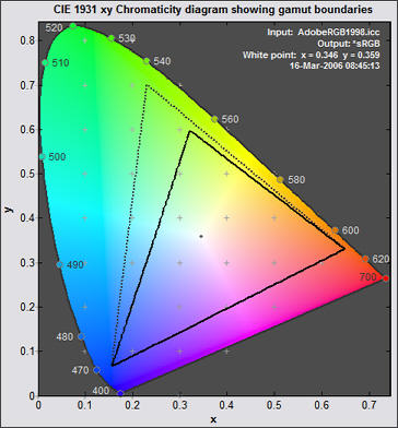
The colors in the diagram are not accurate, but the representation produced by Gamutvision is about as good as can be obtained with the limited color gamut of a computer monitor.
The horseshoe line starting at 400 nm on the lower left and wrapping around the top to 700 nm on the right is called the spectrum locus. It represents the pure spectral colors-- the beautiful, intense colors produced by a prism in clear sunlight. The screen image is but a pale approximation. The straight line connecting the endpoints of the horseshoe is called the purple boundary. The full gamut of human vision lies within this figure. The vertical axis gives an approximate indication of the proportion of green; the horizontal axis moves from blue on the left to red on the right. The location of white depends on the illuminant color temperature. Some typical values (from efg):
The 1931 chromaticity diagram is not without its flaws. The distance between just noticeable color differences (called ΔE) is much greater in the green region on the top than at the bottom; it is not perceptually uniform. For this reason, CIE has defined additional color spaces, particularly CIELUV (1976) and CIELAB (1976), which represent colors more uniformly. But the 1931 diagram persists because of historical inertia. All the CIE color spaces encompass the full gamut of human vision and all are device-independent. Bruce Lindbloom presents the equations for converting between them. But unlike RGB color spaces, they aren't intuitive. The precise meaning of their coordinates is difficult to visualize and they contain values outside the gamut of human vision. Hence they aren't used as working color spaces for image editing. They play a vital but invisible roll in color management; you don't need to understand their details to manage color effectively.
Incandescent lamp 2856o K x,y = 0.448, 0.407 Direct sunlight 5335o K x,y = 0.336, 0.350 Overcast sky, D65 6500o K x,y = 0.313, 0.329
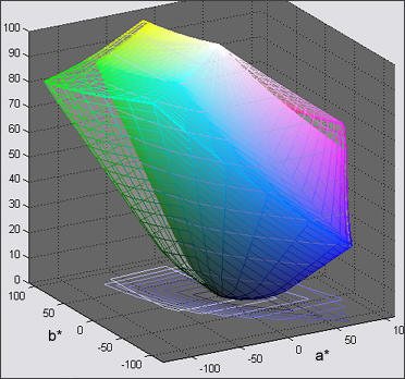
The gamut of sRGB, shown on the right inside the gamut of Adobe RGB (1998), is quite limited. It maintains a distance from the line of purples and is weak in green and cyan, although this weakness is greatly exaggerated by the distortion of the 1931 diagram. In monitors, the gamut is limited by the phosphors, which are chosen for brightness, longevity, low cost, and low toxicity. Ideal phosphors-- with colors located near 450, 520 and 650 nm on the spectrum locus-- don't exist. Most monitors with P22 phosphors have similar gamuts.
Printers, whose colors are based on variants of CMYK (cyan, magenta, yellow, black) subtractive primaries, have gamuts whose shape is more complex than a simple triangle-- often somewhat hexagonal with additional vortices at the Cyan, Magenta, and Yellow primaries. Because inks have imperfect spectra and are somewhat opaque, dark or light colors tend to have smaller gamuts than middle tones. Most four-color CMYK printers have smaller gamuts than monitors, but high quality inkjet printers with more than four colors (typically with the addition of light C and light M) may have larger gamuts. Color slide films have considerably larger gamuts.
Now we approach one of the key issues in color management: How is color represented in computers? We focus on RGB color spaces because they are used for digital image files, and there are a good many of them. Other color models (CMYK, HSV and HSL) are discussed elsewhere on this site and in Microsoft's MSDN library.
In 24-bit RGB color spaces, color is described by three 8-bit bytes, each of which can take on values 0 through 255. Pure red is (255,0,0), green is (0,255,0), blue is (0,0,255), black is (0,0,0), and white is (255,255,255). Some programs like Picture Window Pro and Photoshop CS can utilize 48-bit color that allows values of 0 through 65,536 for each primary color. 48-bit color eliminates banding that can occur when colors are adjusted in the 24-bit mode.
But what exactly is meant by "pure" R, G and B? For a given color space, "pure" R, G and B are the primary colors, located at the apexes of the gamut triangle: R on the right, G on the top, and B on the left. To accommodate the wide range of gamuts in different devices-- digital cameras, film, scanners, monitors, and printers, a variety of color spaces has been developed. The de facto standard for the Internet and Windows, sRGB, has a limited gamut corresponding to a typical CRT monitor. Other color spaces have larger gamuts-- corresponding roughly to high quality printers or to film. Some have extremely large gamuts, covering most of the colors the eye can see and some it can't. Maintaining consistent color appearance in the translation between different devices and color spaces is no easy task; color management provides a reasonably sane and practical solution. But it's is no panacea. Even the most sophisticated system can't make two devices with different gamuts display exactly the same colors; it can't make a monitor or CMYK printer display Velvia-saturated colors.The numeric RGB values of an image file have no clear, unambiguous meaning
unless they are associated with a color space.
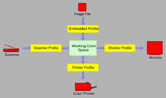
In a color-managed workflow, the color response of each device, each image file, and each image in the computer's active memory is characterized by a file called an ICC profile. ICC profiles have the extension ".icm" and are stored in specific locations on Windows computers.
|
You may need to do some bookkeeping in these folders because problems can arise (especially with pre-XP versions of Windows) when more than about 30 profiles are present. Since profiles are loaded by profile creation programs such as MonacoEZcolor, Windows itself, image editors, and device drivers, they can easily proliferate. I recommend creating a folder called "Unused profiles" for profiles you don't use. If nothing else, it will shorten the drop-down lists. You can obtain a printout of profile descriptions from Picture Window Pro by clicking on File, Color Management... to bring up the Color Management dialog box, then clicking Print Profile List... ICC profiles can also be embedded as tags within image files: TIFF, JPEG, PNG, and BMP are supported by most ICC-aware image editors.
ICC Profiles consist primarily of tables that relate numeric data, for example, RGB (222,34,12), to colors expressed in a device-independent CIE color space called a Profile Connection Space (PCS)-- either CIE-XYZ or CIELAB. The colors may be the objects sensed by a scanner or produced by a printer or monitor. They can also refer to one of the numerous color spaces. Monitor profiles have the same format as color space profiles. Profiles may contain additional data, such as a preferred rendering intent and gamma, Monitor profiles often contain instructions for loading video card lookup tables, i.e., for calibrating the monitor.
The heart of color management is the translation or gamut mapping between devices with different color gamuts and files with different color spaces. Mapping functions are shown in the yellow boxes in the illustration, above. They are performed by a Color Matching Module or Method (CMM), also called a Color Engine, using data in the profiles. The CMM combines the input and output profiles, both of which are referenced to a PCS, to perform a direct conversion between the devices or color spaces. It interpolates data in printer profile tables, which would be prohibitively large if all possible color values were included.
Picture Window Pro uses either the Windows default color engine, ICM 2.0, or an alternative engine, LittleCMS. Adobe Photoshop has its own color engine, ACE. Color engine mappings may be called from ICM-aware programs or device drivers. You must be aware of where the translation takes place in your environment. If you are careless, mapping can take place twice (or not at all), with undesirable results. We will show examples.
For reference, ColorSync is Apple's color engine. ColorMatch RGB is Apple's default color space, with gamma = 1.8 and gamut between sRGB and Adobe RGB (1998). Apple RGB is an older color space with a narrower gamut. Easy to get confused.
Gamut mapping is performed with one of the four rendering intents (gamut mapping algorithms) recognized by the ICC standard and by Windows ICM 2.0. The rendering intent determines how colors are handled that are present in the source but out of gamut in the destination. Since there are several nomenclatures for gamut mapping, I use a color code to distinguish the sources: ICC, Windows ICM 2.0, Picture Window Pro. I'll generally stick with the ICC nomenclature.
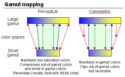 Perceptual,
also called Picture
or Maintain Full Gamut.
This
is PW Pro's default, and is generally recommended for photographic
images.
The color gamut is expanded or compressed when moving between color
spaces
to maintain consistent overall appearance. Low saturation colors are
changed
very little. More saturated colors within the gamuts of both spaces may
be altered to differentiate them from saturated colors outside the
smaller
gamut space. In the diagram on the right, the left and right of the
color
space blocks represents saturated colors; the middle represents neutral
gray. Perceptual rendering applies the same
gamut
compression to all images, even when the image contains no significant
out-of-gamut colors. Bruce
Fraser points out that for an image with unsaturated colors,
e.g.,
with pastels, Relative Colorimetric rendering may produce a slightly
more
accurate result. Perceptual gamut mapping is mostly
reversible;
it is most accurate in 48-bit color. None of the other rendering
intents
is reversible.
Perceptual,
also called Picture
or Maintain Full Gamut.
This
is PW Pro's default, and is generally recommended for photographic
images.
The color gamut is expanded or compressed when moving between color
spaces
to maintain consistent overall appearance. Low saturation colors are
changed
very little. More saturated colors within the gamuts of both spaces may
be altered to differentiate them from saturated colors outside the
smaller
gamut space. In the diagram on the right, the left and right of the
color
space blocks represents saturated colors; the middle represents neutral
gray. Perceptual rendering applies the same
gamut
compression to all images, even when the image contains no significant
out-of-gamut colors. Bruce
Fraser points out that for an image with unsaturated colors,
e.g.,
with pastels, Relative Colorimetric rendering may produce a slightly
more
accurate result. Perceptual gamut mapping is mostly
reversible;
it is most accurate in 48-bit color. None of the other rendering
intents
is reversible.Gamut mapping
links (for geeks) Gamut mapping is a complex
topic, particularly for Perceptual rendering intent. The details of the
are contained within the profile. There are a great ways of performing
Perceptual rendering. Here are some highly technical papers, guaranteed
to generate more questions than they answer. Like what techniques are
actually
used in your profiles? This doesn't sound anything
like the familiar
"you push the button, we do the rest" marketing hype.
|

| Images and text copyright (C) 2000-2013 by Norman Koren. Norman Koren lives in Boulder, Colorado, where he worked in developing magnetic recording technology for high capacity data storage systems until 2001. Since 2003 most of his time has been devoted to the development of Imatest. He has been involved with photography since 1964. |  |