Making
fine prints in your digital darkroom
Background
to monitor calibration and gamma
by
Norman
Koren
updated Feb. 15,
2005
In this page we cover some background (reference) areas related to
gamma.
We discuss
why a new chart was needed (many
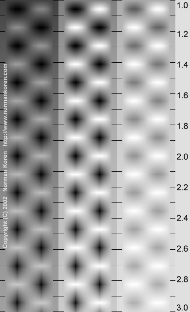
old ones had an error), then we present two additional charts: one for
three
luminance levels and one for three colors
(R, G, B). We illustrate what luminance steps
look
like for different gamma settings. We moved the Praxisoft
WiziWYG instructions to this page: since I put up QuickGamma,
WiziWYG is no longer my choise for monitor calibration. Finally I
discuss
pages by Timo Autiokari, which contain some
dubious
advice on gamma.
Why
a new gamma chart?
 Most
gamma charts consist of an arrangement of black and white patterns and
solid tones. You estimate gamma by viewing the chart from sufficient
distance
(typically one to two meters from the monitor) so you don't see the
pattern
details, then either locating the position where the average luminance
of the pattern matches the solid tone or operating a slider to obtain a
match. Many of these charts use checkerboard patterns, typified by the
pattern on the left: a portion of the gamma chart supplied with Epson
scanners,
enlarged 3x to make the pattern
plainly
visible. This type of checkerboard
pattern
gives an erroneous estimate of gamma!
I owe a debt of gratitude to Pete
Andrews for pointing this out.
 The
problem is the risetime of the video card and CRT monitor. In
most
cases the brightness cannot change from pure black to pure white in the
short distance of one pixel (or even two or three). Since CRTs are
scanned
horizontally, abrupt vertical features are affected.
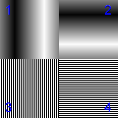
The situation is illustrated in the box on the
right, which consists of four quadrants, each of which contains equal
amounts of Black and White. 1:
vertical alternating B and W. 2:
horizontal alternating B and W. 3:
Vertical B and W alternating every second line (same as 1
magnified 2x). 4:
Horizontal B and W alternating every second line (same as 2
magnified 2x).
If risetime were not a problem, all four
quadrants
would appear equally bright when viewed from a distance. But on most
CRT
monitors, quadrant 1
(alternating vertical lines) appears quite different from 2
(alternating horizontal lines)-- usually darker. Quadrants 2
and 4,
both containing horizontal lines, should be similar. Conclusion:
patterns with vertical features are sensitive to risetime and cannot be
used reliably to estimate gamma. Liquid crystal displays (LCDs) don't
have
this problem, but most have another, worse, problem-- sensitivity to
viewing
angle. For more details see Pete Andrews' Monitor
calibration and Gamma assessment page.
I was dismayed to discover that my monitor's
gamma,
which measured around 2.1 with the old chart, was closer to 2.6. I
corrected
it using my video monitor's software (illustrated above
). I'll be recalibrating my printer and editing many images in
November.
Because of the gamma error I set Contrast to +12, well above the
default
setting (0). I'll undoubtedly reduce it. Annoying and a little
embarassing,
but the end result will be improved print quality.
Three
level and three color charts
Three
level gamma estimation chart
The three level chart on the right enables
you to
estimate display gamma for three normalized luminances: 0.25 (left),
0.5
(middle) and 0.667 (2/3) (right-- 0.75 was too light to be legible).
Gamma
is estimated for each zone by locating the position where the average
intensity
across the zone is constant. The corresponding gamma is shown on the
right.
The section for luminance = 2/3, on the right, is difficult to read.
I use this chart mainly as a diagnostic
tool--
to see if gamma is consistant at different tonal levels. If your
monitor
is working well, gamma should vary by no more than ±0.1
between
the zones. For normal gamma estimation I use the combined gamma/black
level chart, on the previous page. The solid areas are calculated
from
the equation,
pixel
level
= 255*luminance(1/gamma).
|
 |
| Three
color gamma chart
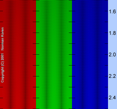
A gamma chart with separate R, G and B
patterns
is shown on the right. It could be useful if you need to adjust gamma
separately
for each color. The blue pattern is dark-- difficult to read. I don't
find
this chart very useful for diagnostics; if gamma is different for
different
colors, you'll see color variations in the gray chart. But it could be
useful in adjusting gamma in special cases, like my ATI Radeon video
card,
where the software doesn't allow the gamma adjustment to be coupled for
the three colors.
|

|
Steps
in pixel level and luminance
The following table displays 21 luminance level steps, from minimum to
maximum, in two different ways. In the top row the pixel levels are
evenly
spaced. In the bottom row the luminance is evenly spaced (linear
stepping)
if monitor is calibrated
for gamma = 2.2, The upper number in each box is the normalized pixel
value
(pixel level/255). The lower level is the normalized luminance for a
monitor
with gamma = 2.2. There are approximately 12.75 luminance steps per box
(255 total).
[These tables will not
display correctly if you are using Netscape and the Always
use my colors, overriding document box is checked (under Edit,
Preferences, Appearance, Colors). You must uncheck it.]
21
even
steps in pixel level (0-255; 0-1 in steps of 0.05, normalized)
Normalized
pixel
level on top; screen brightness for gamma = 2.2 below.
0
0 |
.05
.001 |
.10
.006 |
.15
.015 |
.20
.029 |
.25
.047 |
.30
.071 |
.35
.099 |
.
40
.133 |
.45
.173 |
.50
.218
MID
|
.55
.268 |
.60
.325 |
.65
.388 |
.70
.456 |
.75
.531 |
.80
.612 |
.85
.699 |
.90
.793 |
.95
.893 |
1
1
00. |
0
0 |
.256
.05 |
.351
.10 |
.422
.15 |
.481
.20 |
.533
.25 |
.579
.30 |
.621
.35 |
.659
.40 |
.696
.45 |
MID
.730
.50
|
.762
.55 |
.793
.60 |
.822
.65 |
.850
.70 |
.877
.75 |
.904
.80 |
.929
.85 |
.953
.90 |
.977
.95 |
00.
1
1 |
21
even steps in screen luminance for gamma = 2.2 ( 0-1 in steps of 0.05,
normalized)
Normalized
pixel
level on top; screen brightness for gamma = 2.2 below.
|
Note the large relative luminance steps at low levels in the
lower row, particularly between the first and second box. This is what
you would get for evenly stepped pixel levels with monitor gamma = 1,
resulting
in banding in dark areas (below). In the top row, the relative
luminance
steps at low levels are relatively small; the second box should be
perceptibly
lighter than the first, but still very dark. On the whole, gamma = 2.2
is more perceptually uniform than gamma = 1. Gamma = 1.8 (the value
used
in Macintosh) has near optimal perceptual uniformity; it has a slight
edge
over gamma = 2.2.
The middle (11th) box in the upper row (pixel level 127) has a
normalized
luminance of 0.218. In photography, the 18% gray card is considered
"middle
gray." Reflective exposure meters are designed to give correct readings
when the gray card is used; it is regarded as being close to the
average
density of the "average scene." The flip side of the gray card is 90%
reflectance
white. The normalized reflectance for middle gray is therefore 18/90 =
0.2: very close to the 0.218 luminance of the middle box-- pixel level
127-- for gamma = 2.2.
The following table zooms in on the above table to display the worst
case banding. The top row, for highlights, has evenly spaced pixels
from
236 to 255 in steps of 1. The bottom row, for shadows, has evenly
spaced
luminance steps when viewed with gamma = 2.2, the normal setting for
Windows
and the Internet. It illustrates the banding that takes place with
gamma
= 1.
Worst
case banding examples
Light
areas:
20 even steps in pixel level (236-255 in steps of 1)
Pixel level
on top;
screen brightness for gamma = 2.2 below.
255
1
W |
236
.843 |
237
.851 |
238
.859 |
239
.867 |
240
.875 |
241
.883 |
242
.891 |
.243
.899 |
244
.908 |
245
.916 |
246
.924 |
247
.932 |
248
.941 |
249
.949 |
250
.957 |
251
.966 |
252
.974 |
253
.983 |
254
.991 |
255
1
W0 |
Blk
0
0 |
21
.004 |
28
.008 |
34
.012 |
39
.016 |
43
.020 |
46
.024 |
50
.027 |
53
.031 |
56
.035 |
59
.039 |
61
.043 |
64
.047 |
66
.051 |
68
.055 |
70
.059 |
72
.063 |
74
.067 |
76
.071 |
78
.075 |
Blk
0
0 |
Dark
areas: 20 even steps in screen luminance (in normalized increments of
1/255),
illustrating
integral pixel steps (0,1,2,3,...) for gamma = 1 (when displayed at
gamma
= 2.2)
Pixel level
for
gamma = 2.2 on top; normalized screen brightness (n/255) below.
|
I find the highlight banding to be barely preceptible, if at all.
But
the shadow banding-- what you would get with gamma = 1-- is obvious and
unacceptable. There would be no visible shadow banding with gamma = 1.8
or 2.2.
.
Timo
Autiokari and AIM (Accurate Image Manipulation)
| Timo Autiokari's Accurate
Image Manipulation for Desktop Publishing website is beautifully
designed,
rich in content, and seems well organized at first glance. Timo thinks
for himself; he doesn't follow the herd.
But his page contains significant misinformation. He
states that image
editing introduces serious
errors unless gamma is set to 1. And indeed, problems can arise in
operations that involve strongly contrasting adjacent pixels.
Blurring, which involves averaging neighboring pixels,
is a good example.
If you blur two adjacent pixels with values 1 and 255, you get pixel
values
around 128, which appear darker than the average of pixels 1 and 255 if
gamma is larger than 1. (This is the basis of the gamma chart, above.)
This effect causes visible errors with extreme sharpening and heavy
blurring
(visible in
Timo's
examples), and rotation (see Helmut Dersch's page on interpolation;
alternate
site), but there are no problems with
operations
on individual pixels such as color and tonal adjustments.
And none with reasonable (not extreme) sharpening-- only with severe
oversharpening
with exaggerated edge contrast.
For the most part, Timo is wrong about gamma.
The primary
reason for rejecting his assertion is the banding in shadow areas with
gamma =1, illustrated above. This banding would be visible on prints. You
are best off sticking with your system's standard gamma (2.2 for
Windows,
1.8 for Macintosh) for image editing.
Timo doesn't comprehend the simplicity of the gamma
relationship, luminance
= (pixel level/255)gamma. In the Introduction
to System Calibration, he states,
"Remembering
that
all the hues on the screen are additive mixtures of the red, green and
blue primary colors it is easily understood that gamma produces
hue-shift
also when these tri-color codes are edited."
Absolute nonsense! Though his statement would be correct if RGB data
were
uncorrected
for gamma. In practice, the same gamma is assumed for each individual
color
in an RGB file; there is no hue shift when it is printed or displayed.
In editing operations that affect color and brightness, RGB images are
temporarily converted into a format such as HSV
or HSL where hue, saturation and lightness (or brightness) are
decoupled.
Again, there is no hue shift, though these operations are performed
with
best accuracy in 48-bit color.
Timo assumes that 2.5 is the standard gamma for PC's.
Wrong! The de
facto standard is 2.2. But Timo insists on using 2.5 for examples
throughout
his page. 2.5 is the average gamma of an uncorrected monitor,
but
I've seen values between 2.2 and 2.8. That's why gamma adjustment is
important.
The more I grapple with Timo's "logic," the more
frustrated I get. His
examples look impressive from a distance, but they are obtuse and often
miss the point entirely. Charles
Poynton has responded to Timo's
savage, emotional attack (which I find to be so mathematically
muddled
as to be unreadable) with a cautionary
tale. Poynton knows
his stuff. As much as I like mavericks, I must side with the
establishment
on this issue. See also, Timo's
technical argument | Timo
and linear coding| Linear
and nonlinear coding | Gamma
FAQ.
|
|
Back
to Monitor calibration and gamma
.
|
Images
and text copyright (C) 2000-2013 by Norman Koren. Norman Koren lives
in Boulder, Colorado, where he worked in developing magnetic recording
technology for high capacity data storage systems until 2001. Since 2003 most of his time has been devoted to the development of Imatest. He has been involved with photography since 1964. |
 |

 Most
gamma charts consist of an arrangement of black and white patterns and
solid tones. You estimate gamma by viewing the chart from sufficient
distance
(typically one to two meters from the monitor) so you don't see the
pattern
details, then either locating the position where the average luminance
of the pattern matches the solid tone or operating a slider to obtain a
match. Many of these charts use checkerboard patterns, typified by the
pattern on the left: a portion of the gamma chart supplied with Epson
scanners,
enlarged 3x to make the pattern
plainly
visible. This type of checkerboard
pattern
gives an erroneous estimate of gamma!
I owe a debt of gratitude to Pete
Andrews for pointing this out.
 The
problem is the risetime of the video card and CRT monitor. In
most
cases the brightness cannot change from pure black to pure white in the
short distance of one pixel (or even two or three). Since CRTs are
scanned
horizontally, abrupt vertical features are affected.
