Color management: Implementation part 1:
Setup, working color space, anatomy of a profile
by Norman Koren
|
Thanks to Dennis Wilkins and Jonathan Sachs for excellent suggestions and extensive proofreading.
The series begins with an Introduction to color management and color science. Implementation part 1 (this page) describes how to set up color management and interpret the contents of ICC profiles (files that describe the color response of a device or a color space). It features Picture Window Pro, but also includes information on Photoshop. Implementation part 2 discusses monitor profiling and workflow details. The series continues with Obtaining ICC profiles and building them with MonacoEZcolor and Evaluating printers and ICC profiles.In this Part 1 we introduced color science and color management. In this part we describe how to implement color management in ICC-aware image editors. We emphasize Picture Window Pro, but we also discuss Photoshop.Carlos E. Mora's Spanish translation: Gestión del color: Implementación (1ª parte).

| establishing a working color space for editing and storing images; |
| establishing procedures for handling images from input devices, such as scanners or digital cameras; |
| establishing policies for handling image files that are untagged or have different color spaces; |
| creating or selecting the monitor profile and selecting the monitor rendering intent; |
| selecting the printer profile and rendering intent. |
The colors in the above table are keyed to the simplified image flow diagram, below, as well as the table of color management settings for Picture Window Pro and the detailed image flow diagram in the Workflow summary in Implementation part 2.
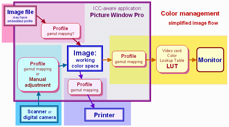
| Color management setup: the recommended settings for getting started. |
| Working color space: the color space used for editing and storing images. |
| ICC Profiles: their contents, i.e., their "anatomy." |
| Monitor profiling and calibration. |
| Workflow issues including handling input devices, files, and printers. |
| Summary: the detailed image flow diagram. |
| Appendix: The GretagMacbeth ColorChecker in sRGB and Adobe RGB. |
By the time you finish this tutorial you'll be intimately acquainted with "the devil in the details," and how it can bite you if you're not careful.
| Picture Window Pro,
supports
color management with Windows 98, ME, 2000, XP, or later. To enable it,
Click File,
Color
Management... This brings up the dialog box shown on the
right.
Then set Color Management:
to Enabled.
The dialog box settings are applied immediately and remain in effect as
long as the box is open; you can leave it open as long as you want.
When
you close the box, you will be asked, Save
modified settings? Click Yes
to retain the new settings. Click No
to revert to the previous settings. You can also load save settings.
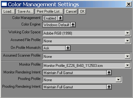
Merely enabling color management has only one effect. Embedded profiles in image files are recognized. Files without embedded profiles are assumed to be sRGB, and no gamut mappings are performed. To unleash the power of color management, you need to make appropriate dialog box settings, summarized in the table below. Settings that require particular attention are highlighted in red and discussed afterwards. To determine if an image has an embedded ICC profile, right-click on it and select Display Info. |
 |
| ..Color
Management Settings for Picture Window Pro
.. Settings that require special attention are highlighted in red; recommendations are in violet. |
||
| Box | Settings | Recommendations and comments |
| Color Management: | Disabled or Enabled | Enabled turns on color management. |
| Color Engine: | Windows Default (ICM 2.0) or lcms (Little CMS) | Windows Default. Lcms probably works equally well. |
| Working Color Space: | Choice of profiles*or
None
(The actual working color space of an image can be determined by right-clicking on the image, clicking on Display Info and observing the Color Profile setting.) Used differently from Photoshop. See note below. |
Specifies the working the color space to convert images when they are opened, if you so choose. (See On Profile Mismatch.) Has no immediate effect on image appearance. A key user decision. sRGB is the simplest and most compatible with monitors and the Internet, but a Medium-gamut color space such as Adobe RGB (1998) (identical to SMPTE-240M) is recommended when the primary output is high quality prints. Wide gamut spaces present some problems. The ICC profile of the working color space will be embedded in the image when it is saved. See Working color space, below. |
| Assumed File Profile: | Choice of profiles* or None | The assumed color space of an image file that has no embedded profile. sRGB (Windows/Internet default) is usually the best choice. The default, None, implies sRGB. |
| On Profile Mismatch: | Ask/Convert/Don't Convert | Ask is the best choice to start out with. The dialog box will ask for the rendering intent. (Don't Ask/Don’t Tell was omitted.) |
| Assumed Scanner Profile: | Choice of scanner profiles* or None | I recommend NONE if the profile can be selected in the scanner driver. Otherwise select the appropriate profile here. It should not be selected in both; the profile would be applied twice. If you set the scanner profile here, the imported file will contain original scanner data with the scanner profile embedded. You may be asked if you want to convert it into your working color space. Selecting the profile in the scanner driver software reduces the chance of error; the results are identical. |
| Monitor Profile: | Choice of profiles* or None | You should use the profile created by your monitor profiling program. It's a good idea to check it with ICC Profile Inspector to be sure the TRC (tone response curve) tags agree with the value of gamma set during calibration (usually 2.2). If your monitor profile has a different gamma, use sRGB IEC61966-2.1, which is an essentially neutral profile with gamma = 2.2 and R, G, and B primaries close to typical CRT monitors. If None is set, images are sent to the monitor without gamut mapping. This can result in significant errors for working spaces other than sRGB. See Monitor profiling. |
| Monitor Rendering Intent: | One of the four rendering intents | Maintain Full Gamut (Perceptual) is the best choice in most cases. |
| Proofing Profile: | Choice of printer profiles*
or None |
None, most of the time. Used mainly by the printing industry to preview low gamut CMYK printing press output on the monitor. To preview a printer/ink/paper combination, select the appropriate profile. May not work well with high quality inkjet printers. Compare it with your printed output to see if it works for you. |
| Proofing Rendering Intent | One of the four rendering intents | Preserve Identical Colors and White Point (Relative colorimetric) or Maintain Full Gamut (Perceptual). Try both; the difference can be significant with large gamut working color spaces. Inactive when Proofing Profile is set to None. |
| Monitor Calibration | (Removed from current versions of PW Pro. It set the LUT, overriding other calibration settings.) | Disabled |
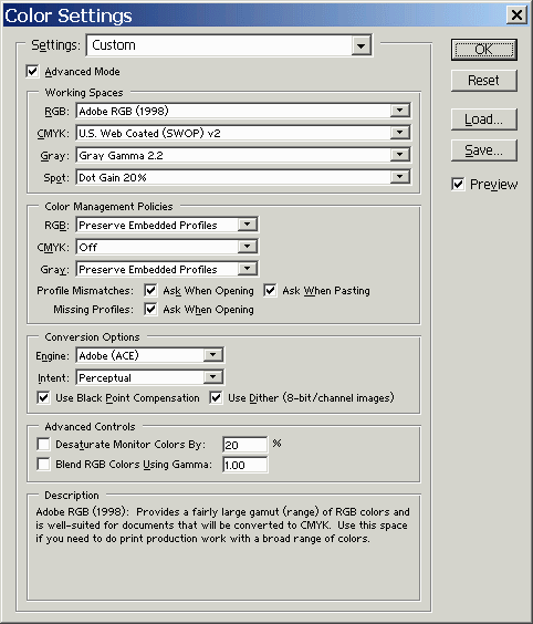
Photoshop
color management is more error-prone than Picture Window Pro. Because
Photoshop
tries to be all things to all people-- in the graphics and printing
industries
as well as in photography, it has a number of obscure settings that must
be set correctly for the monitor image to display correctly.
|
 | |||||||||||||
|
Without color management the Windows default sRGB color space is assumed. sRGB has a limited color gamut, approximating that of the average computer monitor. When you print on a high quality inkjet printer, which has a larger gamut, you adjust the printer driver settings to take advantage of the device gamut. You might, for example, boost the Saturation setting, as I've described in Printer calibration.
A color space can be associated with an image when it is opened or at any time during an editing session. But it's a good idea to make the association as early as possible in the editing process— during scanning or RAW conversion, if possible. Settings and techniques for performing the association are summarized in the table below.
| Attaching color spaces to images | On open | During the editing session |
| Picture Window Pro | Determined by three Color Management Settings: Working Color Space, Assumed File Profile, On Profile Mismatch. The user may be asked what action to take. | Click on Transformation, Color, Change Color Profile... Pay attention to the Change setting. Use Input Data and Profile setting to convert between color spaces. Use Profile Setting Only to attach a profile without changing the image data. Details in Implementation part 2. |
| Photoshop | Determined by Color Settings for Working Spaces and Color Management Policies. The user may be asked what action to take. | Click on Image, Mode, Assign profile... or Convert to Profile... |
| When an image with an associated color
space is saved, the ICC profile
of the color space is embedded
in the image file-- saved along with it. This doesn't increase the
stored
image size by much because color space profiles are tiny. In
a color managed workflow it's always good pratice to embed ICC profiles
in images. Otherwise confusion can
result. Photoshop, for
example, treats images without embedded profiles differently
from Picture Window Pro and other applications.
The gamuts of several color spaces are shown in the chart on the right, which has been adapted from Jonathan Sachs' Color Management tutorial. See pp. 10-14, for details. Color spaces can be divided into three categories.Small-gamut spaces have gamuts comparable to CRT monitors. sRGB (gamma = 2.2, white point = 6500K) is the default color space for Windows and the World Wide Web. PAL/SECAM and SMPTE-C are appropriate for video output. sRGB is weak in green and cyan (but not as weak as the perceptually-nonuniform xy chart indicates). If you're working in another color space, you'll need to convert to sRGB for Internet display.Medium-gamut spaces have gamuts somewhat larger than CRTs; comaprable to high quality (more than 4-color) inkjet printers. Adobe RGB (1998) (same as SMPTE-240M) is the best known. Gamma = 2.2; white point = 6500K. Adobe RGB (1998) is the most widely recommended color space when the primary output is high quality inkjet prints. Most shops that make LightJet prints prefer Adobe RGB (1998) or similar color spaces. |
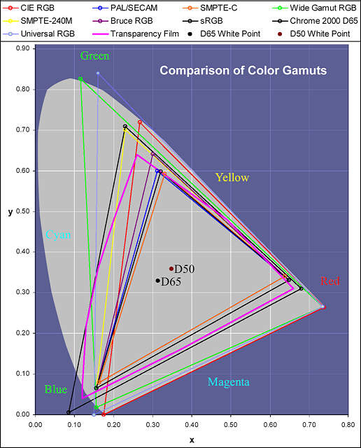 |
Wide-gamut spaces have gamuts much larger than CRTs or inkjet printers, often comprising most of the colors the eye can see-- and sometimes "colors" the eye can't see. Wide gamut RGB, Universal RGB, CIE RGB, Chrome 2000 D65, and Kodak ProPhoto RGB are examples. The gamut of Chrome 2000 approximates that of transparency film. When colors in wide gamut spaces are squeezed into monitor or printer color spaces using perceptual rendering intent, clipping and color shifts may take place (predictable with Gamutvision image analysis; unpredictable otherwise). Since half or less of the total gamut can be reproduced on monitors or printers, using a wide-gamut space sacrifices bit depth-- something you can ill afford when which working with 24-bit color, which has a bit depth of 8. The solution is to work with 48-bit color. See Bruce Fraser's article, The High-Bit Advantage. Wide-gamut spaces can be tempting; a number of experts recommend them. I'm not among them. There are alternative views: RIMM/ROMM RGB Color Encodings by Spaulding, Woolfe and Giorgianni makes a strong case for wide-gamut spaces (RIMM/ROMM is the same as ProPhoto).
| RGB color spaces are strongly preferred over CMYK for photographic reproduction. All high quality (more than 4-color) inkjet printers must be driven by RGB data; they aren't really CMYK because of the additional colors. CMYK spaces are device-dependent, limited in gamut, and there is no unique representation of colors in CMYK-- different gray component replacement algorithms are appropriate for different printers and intents. CMYK is best left to the 4-color printing industry. Picture Window Pro doesn't support CMYK. |
|
Working color space recommendations. The safest color spaces have gamuts comparable to (or slightly larger than) the preferred output devices. This minimizes color distortion when files are mapped with perceptual rendering intent; it also minimizes the risk of clipping out-of-gamut colors with relative colorimatric intent. sRGB is the default working color space for the Web. Adobe RGB (1998) is widely recommended when the primary output is high quality inkjet printers. There is some unresolved controversy about the use of wide gamut spaces; they might be OK when used with 48-bit color images. If you want to study color spaces, gamut mappings, and rendering intents in depth, I recommend Gamutvision. (As the author of Gamutvision I can't claim to be unbiased.)
In the presentation Metrics for Comparison of Color Encodings (CIE TC8-05) by Kevin Spaulding and Gus Braun of Kodak, available online from colour.org, the authors have created a CIE xy diagram representing the full range of colors available from reflective surfaces. They used a wide variety of sources (graphic arts spot colors, etc.) to assemble this diagram (slide 5 in the presentation). It is instructive to compare their results to the two best known color spaces, sRGB and Adobe RGB (1998).
 Real-world reflective colors |
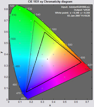 Adobe RGB (dotted), sRGB (solid) |
Although the eye can see more highly chromatic colors than these (the outer horseshoe), they are extremely rare in nature. The best examples are the vibrant colors of a prism in the sun and some rare irridescent butterflies— colors that can't be reproduced by standard output devices (monitors or printers). Adobe RGB (1998) encompasses most of the reflective colors; only a few reds and cyans are out of gamut, and not by much. The eye is not extremely sensitive to chroma differences in highly saturated colors. So Adobe RGB is a safe, conservative choice for a working color space. sRGB is clearly weaker in greens and cyans. It's the standard color space of Windows and the internet— by far the most convenient, foolproof choice , but Adobe RGB is preferred when the intended output is high quality inkjet prints.
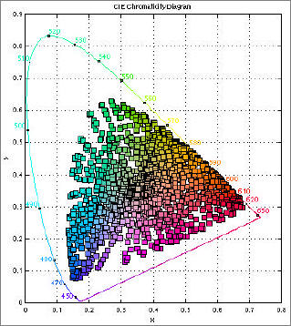
The reader is cautioned that the CIE 1931 xy chromaticity diagram has several well-known limitations. The space occupied by the greens is exaggerated, and the 2D representation has no information on the lightest or darkest colors.
|
|
|
|
|
|
|
|

| Images and text copyright (C) 2000-2013 by Norman Koren. Norman Koren lives in Boulder, Colorado, where he worked in developing magnetic recording technology for high capacity data storage systems until 2001. Since 2003 most of his time has been devoted to the development of Imatest. He has been involved with photography since 1964. |  |
 ICC
profiles consist of a header and and a set of tags, which contain the
bulk
of the data.
ICC
profiles consist of a header and and a set of tags, which contain the
bulk
of the data.
 wtpt is the white point. The two standard
white points are 6500K
(D65): X=0.95045, Y=1.0, Z = 1.08905, and 5000K
(D50): X=0.96429,
Y=1.0, Z=0.82510. Y is always 1.0 and Z varies the most. Used for
absolute
colorimetric gamut mapping, which is of little interest to
photographers.
wtpt is the white point. The two standard
white points are 6500K
(D65): X=0.95045, Y=1.0, Z = 1.08905, and 5000K
(D50): X=0.96429,
Y=1.0, Z=0.82510. Y is always 1.0 and Z varies the most. Used for
absolute
colorimetric gamut mapping, which is of little interest to
photographers.